Skip to content

Shopify / Web design system

Brochure Kit

A unified design system bridging Figma and code for Shopify marketing. Built on a three-tier token architecture and an atomic component library, Brochure Kit cuts duplication, supports multiple themes, and powers 600+ production pages.

Company
Shopify
Role
Lead designer
Tools
Figma, Claude, Codex, React, Storybook, After Effects
Focus
Design system, design tokens, atomic components, AI-assisted workflow
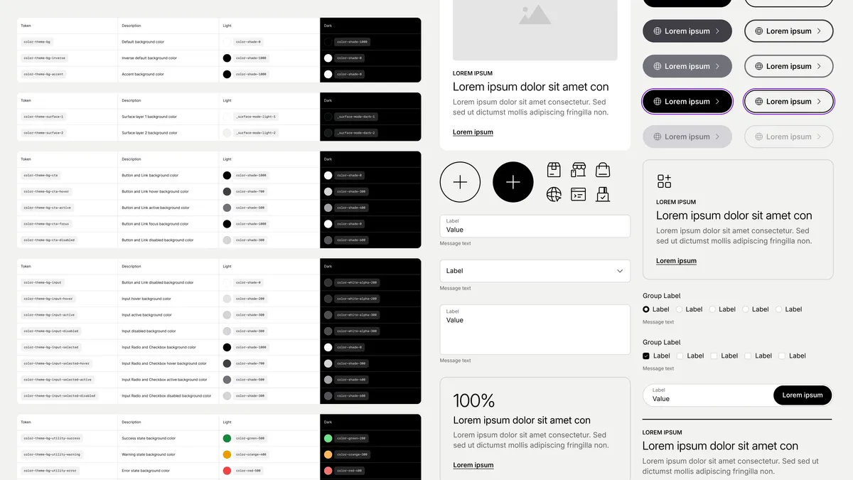
Brochure Kit light and dark color token tables alongside button states, cards, icons, and form controls

01 / Challenge

Scaling without a shared token foundation

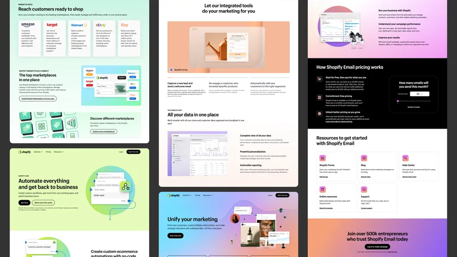
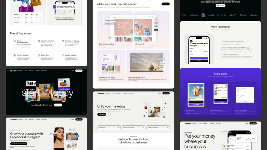
As marketing pages scaled across business segments, teams worked without a shared token foundation. Hardcoded values led to component drift, duplicated code, and inconsistent branding across pages.

Collage of Shopify Marketplace Connect, Flow, marketing, and Email pages showing varied gradients, typography, cards, and section layouts
Collage of Shopify shipping, store builder, social selling, marketing, and finance pages with differing card styles, colors, and visual treatments

02 / Approach

Auditing the current state to find common ground

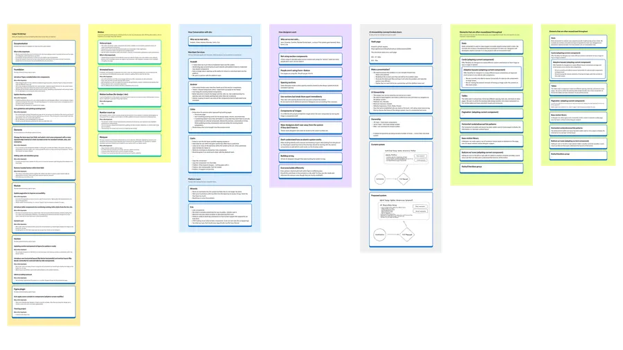
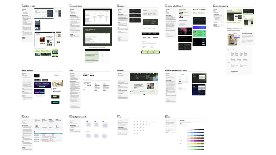
To find gaps in the library, we interviewed internal design and development teams and audited every marketing page, consolidating repeated patterns and deciding which custom components to optimize or add.

Research board grouping team interview notes, design system tasks, motion requirements, governance diagrams, and missing or underused components
Component audit boards comparing existing cards, tables, forms, carousels, icons, colors, and spacing, with recommendations for standardization

03 / Solution

An adaptable, shared language for teams

A flexible foundation ensures design consistency while supporting distinct visual themes across design tokens, components, and workflows.

Design tokens

Dynamic theming framework

I built a three-tier token pipeline (Primitive, Semantic, Component) covering color, typography, spacing, surface, and radius. It enables instant theme switching, responsive scaling, and section-level overrides that leave global styles intact.
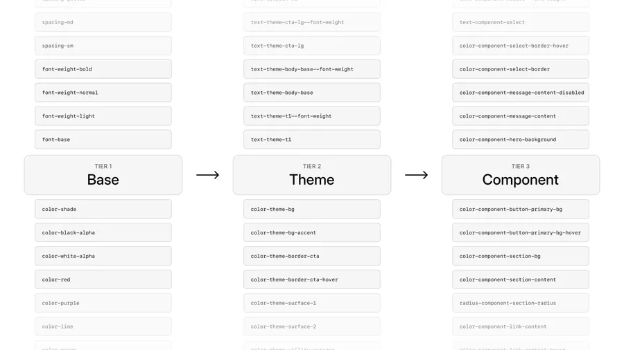
Three-tier token naming diagram linking Base tokens to Theme tokens and then Component tokens, with color, typography, and spacing examples
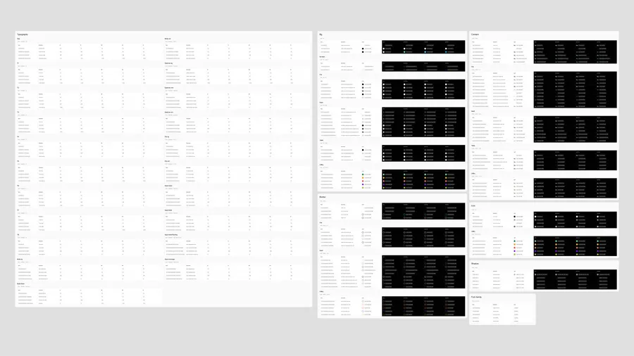
Brochure Kit token reference tables documenting responsive typography and theme values for backgrounds, content, borders, icons, shadows, and font families
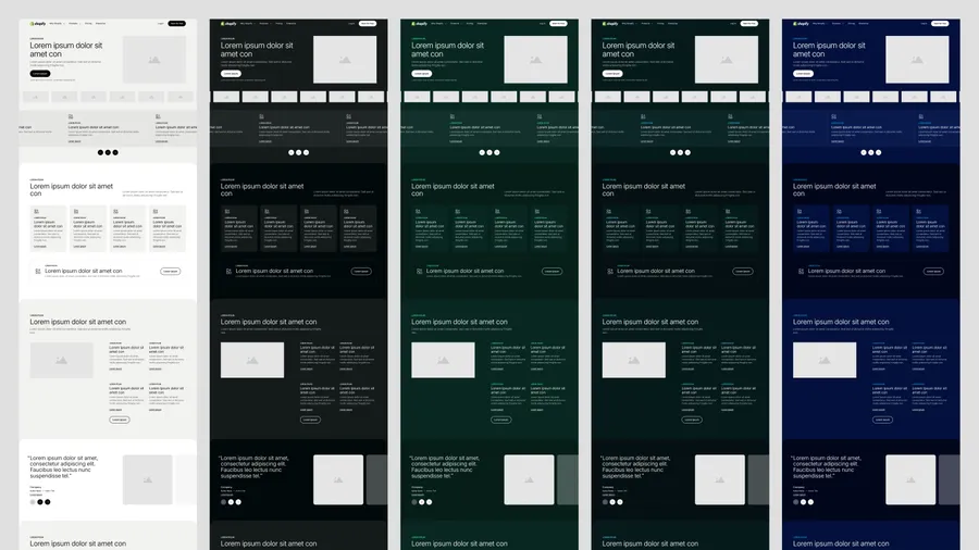
The same Shopify page layout rendered in five themes: light, dark, dark green, dark teal, and dark blue

Atomic components

Streamlining component library

Years of iterations left the library full of redundant, rigid components. I audited them alongside recurring page patterns and rebuilt the library around elements, modules, and compositions: flexible building blocks that are easy to find and use.

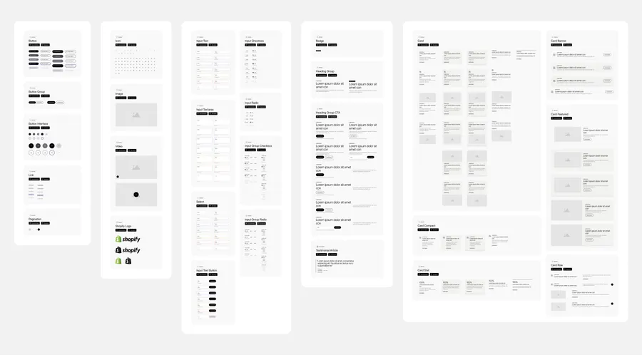
Brochure Kit library overview showing buttons, links, icons, media, form controls, heading groups, and card variants
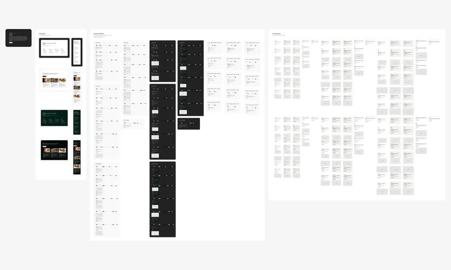
Card component documentation with desktop and mobile examples, annotated light and dark specifications, and a matrix of content and layout variants
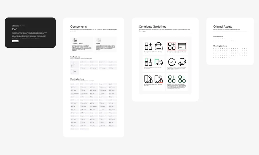
Icon library documentation showing outlined and stroke variants, interface and marketing icons, and contribution guidelines for sizing, spacing, and pixel alignment

Modernization

Making the design system AI-ready

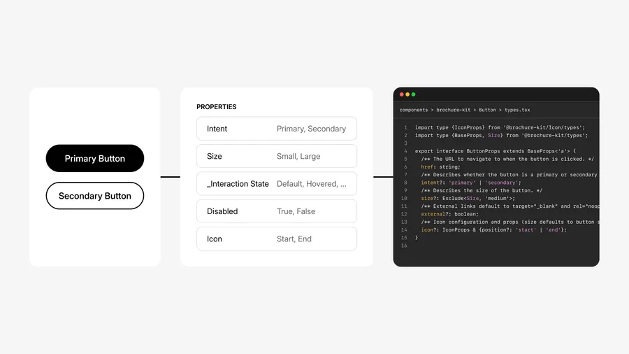
I restructured component names into a flat, machine-readable namespace and wrote token metadata, usage boundaries, and step-by-step assembly recipes so AI tools can compose pages reliably.

Diagram connecting primary and secondary button designs to Figma properties and TypeScript props for intent, size, disabled state, and icon placement

Automated workflow

Minimizing repetitive tasks

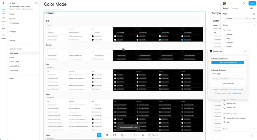
Token documentation is tedious to create and maintain. I used AI agents to build Figma plugins that generate and update it instantly.

Brochure Kit Figma plugin beside generated color token tables, with controls to create documentation for all variable collections or a selected collection

04 / Outcomes

Scaling consistency and speed across Shopify

Brochure Kit brought Shopify marketing onto a single production pipeline. Separating themes from components sped up page launches, reduced brand drift across pages, and lowered ongoing maintenance across business lines.

Production pages
600+
Cross-functional teams
20+
Atomic components
50+
Dynamic themes
3