Atomic components
Streamlining component library
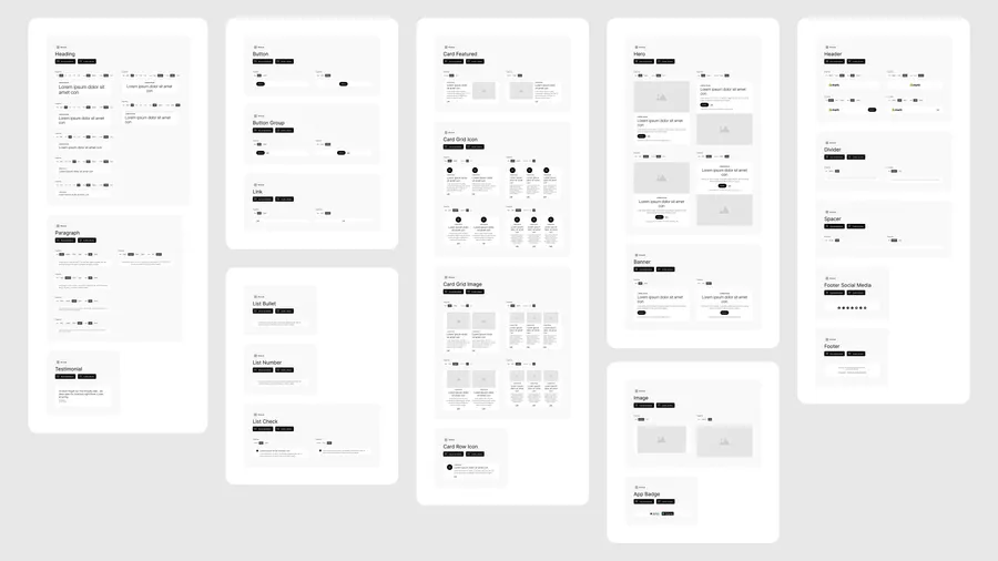
I audited the bloated legacy library and consolidated it into a lean set of elements and modules that marketing teams can easily find and combine.
Shopify / Email design system
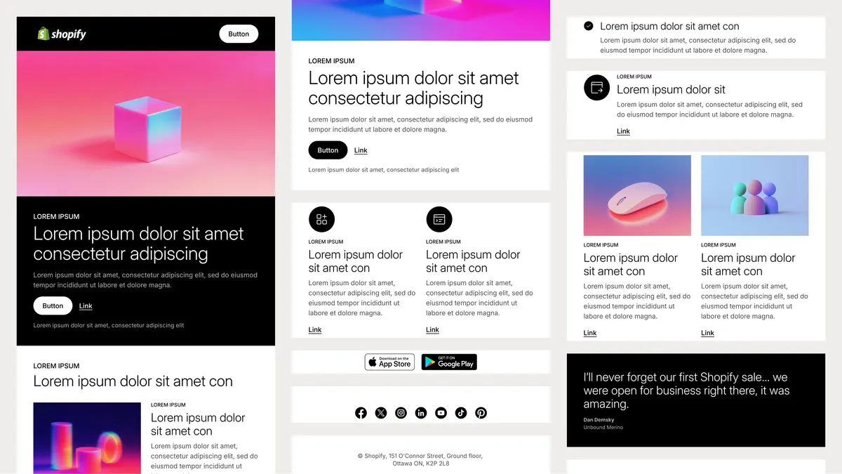
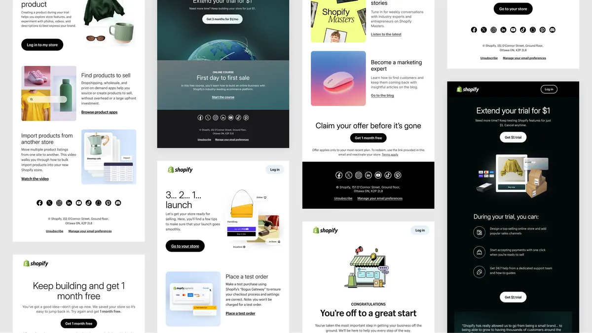
A unified component system bridging Figma and code for Shopify email marketing. By rebuilding layouts, standardizing spacing, and reaching 1:1 design-to-code parity, Mozart Kit speeds up production and makes AI-generated emails possible.
01 / Challenge
Over many iterations, email components drifted out of sync. Misaligned layouts, names, and properties slowed developer handoff, complicated QA, and delayed campaigns. On top of that, every component had to render reliably across major email clients, each with limited and inconsistent HTML and CSS support.
02 / Approach
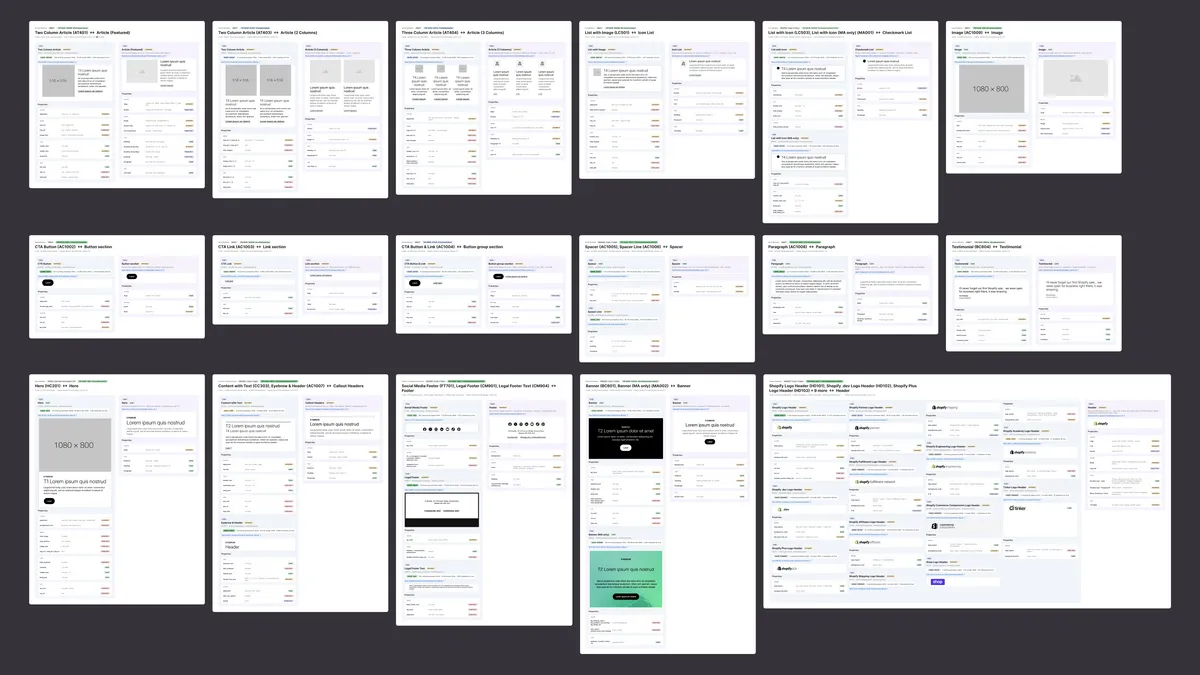
Before restructuring, I analyzed where design and code had drifted apart. Using Claude, I audited the legacy components, mapping layout differences and mismatched properties to set a baseline for the new architecture.
03 / Solution
A modular component architecture for Shopify emails, aligned 1:1 with code so designers and developers work from the same structure. Every layout and spacing decision was designed within email-safe constraints, so components render consistently across email clients.
Atomic components
I audited the bloated legacy library and consolidated it into a lean set of elements and modules that marketing teams can easily find and combine.
Documentation
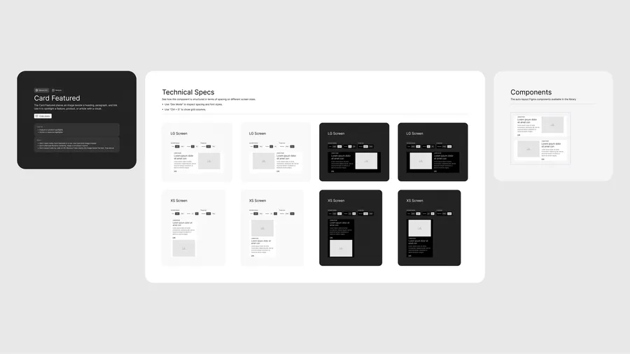
Documenting a component library by hand can take weeks. Using Claude, I built a standardized template workflow that generates detailed documentation in hours, giving designers and developers clear instructions right away.
Spacing
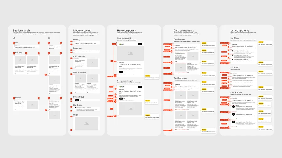
The legacy spacing model was rigid and broke easily when layouts changed. I replaced complex variants with a simple, systematic spacing structure, so teams can rearrange layouts without breaking spacing. Built on table-based layouts and inline styles, it holds up even in email clients with limited CSS support.
Icon library
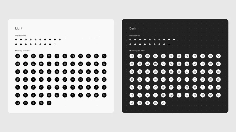
Marketers often build emails without design support, which leads to visually flat campaigns. I added a central icon library to the system so LLM agents can suggest and apply fitting visuals automatically.
Modernization
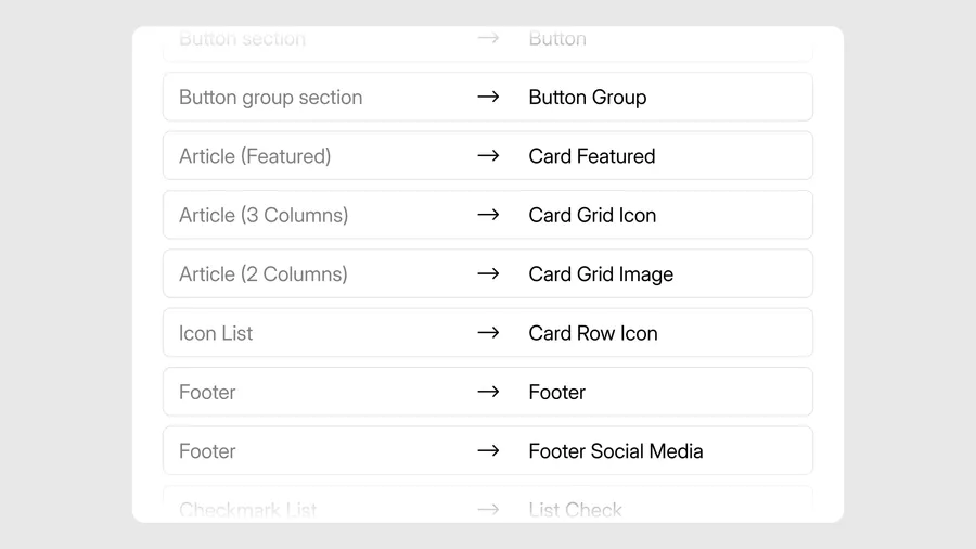
I aligned component structures, properties, and names exactly between design and production. This 1:1 mapping lets LLM agents pick the right components and assemble on-brand emails within design guardrails.
04 / Outcomes
Mozart Kit gave Shopify email marketing a single, code-aligned component system. Matching structures, properties, and names between Figma and production removed handoff friction and sped up campaign production.